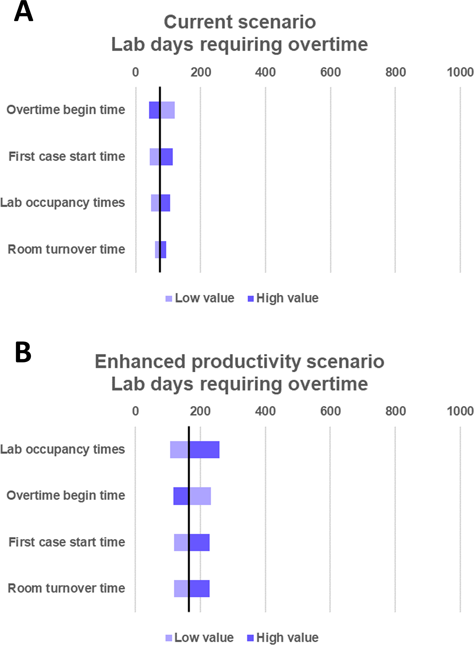
Panel A is a tornado chart showing the impact of varying the model inputs according to the high and low values from Table 1 for the current scenario. According to the model, the x-axis represents the number of lab days that require overtime. The limits of the horizontal bar associated with each variable indicate the number of simulated overtime days when the indicated parameter is changed to the low value (light blue) or high value (dark blue) while holding the other variables constant. Panel B represents the number of overtime days within the model when each variable is changed independently to the low (light green) or high (dark green) value for the Enhanced Productivity Scenario. Source: Prepared by the authors of this study.